Jump to content

The Art of Ian Clark on Uk Vibe

The Art of Ian Clark on Uk Vibe magazine cover


The Uk Vibe website has a must visit lengthy and photo heavy article just up. The title 'The Art of Ian Clark' should have you already right clicking and opening in a new window, but if you are still here and not convinced here's a brief preview of what you be getting.. 


vibe1.thumb.jpg.b4a3c150c2606c8427d59aa0

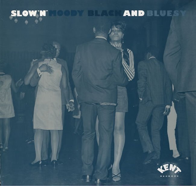
A Soothing ‘Slow Moody Black n Bluesy’ Art Direction by Ian Clark Image taken at a Reggae night in West Ealing sourced from Pictorial Press, Described by Ady Croasdell as ‘The Mona Lisa of Soul Music’ Due to the stare of the young lady in pic.

The Kent section did not resemble your average soul reissues, gone were the flared trousers of a bygone era – out went the in-house design team, and in came a stylish new school with argyle socks and hi rise trousers. These album sleeves were as fresh as fungus in their day (with exception to Factory records Manchester of course). They were in a world of their own visually, unlike anything else in the racks. They held a moth like attraction for this young soul student, you just felt that passion.
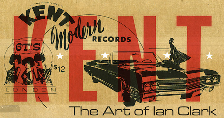
Ian Clark was able to draw on his large collection of found images/typefaces sourced in junk shops and dusty markets and travels, this was such an important factor back then. The original intentions were to emulate original soul graphics from old records Like Imperial or King however a new rawer visual language soon mutated.

vibe3.thumb.jpg.9a725e67ff262a7fc95a036c

The first Kent album I owned was ‘Club Soul’, the cover art was a huge decider, ‘Club Soul’ had a Colin McInnis ‘Absolute Beginners’ vibe to it, like a lot of Val Wilmer’s photography. This was a subtle homage to early modernist and all-nighter roots in the heart of the Capitol. I always liked the fact that Kent acknowledged the mod foundations of soul culture that was noted

“The casino winners, that picture came from a guy I worked with at college in Surrey when I ran their graphics unit, he went to Las Vegas came back with some pictures and he said “have you seen these they’re quite nice” I thought Bloody ’ell.” Ian Clark on Winner Takes all LP

Many artists would keep alphabetically filed picture libraries gathered from magazines – images like Atomic Explosions/Apples etc. This also involved filtering through vast archives of imagery like you would record diggin’. This was roots visual sampling – more fun than Google any day.

above preview source credit Mark Wallace and ukvibe.org 

get brew, right click now.

http://ukvibe.org/visual_world/the-art-of-ian-clark/


vibe4.thumb.jpeg.ce053f0ffe3c27e6497f363


Edited by Mike


  • Helpful 1

Source Advert


Members Comments

Recommended Comments

Thanks Mike, nice article about some all round fantastic albums. Interesting stuff behind the pics too, I didn't realise it was all so diy.

 Shoes was always one of my favourites looks-wise, though as a Berkshire bumpkin who used to go to London for the 100 club only (apart from a couple of trips for threads and a 2nd hand record shop on Tottenham Court Road) it always pissed me off that I could never find any trousers that looked....well, just like that. I had a thing for them but never found any that were 'just right', didn't have a clue where to get them from. 

And I still can't - and it still pisses me off.....album time, I think

Link to comment
Social source share

Loved al the Kent/Modern covers and paid tribute to them by ripping off Clarkie's style for my own posters for our soul club in Edinburgh back in the 8Ts (never heard of copyright then!) - hours of rubbing letraset over pictures of the Marvelettes or putting a blanking piece of text over the cover of an Impressions EP or adapting a Columbia sleeve of 'teens' dancing with the added bonus of making different version of the poster with a variety of 45 labels inside the sleeve. This sort of thing. Simple when you look back really... .


180950.thumb.jpg.dc4e1495287557a3a63a253

the-impressions-youve-been-cheatin-1966.ggg.thumb.jpg.1b53994a7e724888d66a31fe86hhh.thumb.jpg.5d3011781b7f47394143b3b843

In fact, I still design posters for non-existent Soul clubs to pass the time - a lot easier with Photoshop if not quite so exciting seeing what you could dream up on limited funds and equipment back then.


Link to comment
Social source share

Excellent to recognise Ian's work. A top fella. For what it is worth and some may not know but he also did lots of flyers and a number of the covers of Blackbeat magazine.

Link to comment
Social source share

Guest Johnny One Trout

Posted

Marvalus and informative, I never really knew about Ian's involvement in al that early Kent artwork so much refined from his earlier crap-o-graphic period..

Link to comment
Social source share

One of the best is Ian and great designs for Kent in the early years, always had time for you and many a great 45 bought from looking through his sales on the stage at the 100 club.

Link to comment
Social source share

Ian's creations were the backdrop of a soul generation. Always cool as you like and a welcome departure from the cartoon owl graphics of a decade before.


Link to comment
Social source share

Nice post! Ian's a talented artist alright and pleased to see the recognition. I knew Ian when he lived in the deep south - Guildford, Surrey (& bravely let me spin tunes at his early 90's 'Soul City' night in London a few times). Even his emergency flyers were something else!

soul city flyer 001.jpg

Link to comment
Social source share

Excellent to recognise Ian's work. A top fella. For what it is worth and some may not know but he also did lots of flyers and a number of the covers of Blackbeat magazine.

One of the great unsung heroes of the scene and a man with a fine eye for art and I remember his Clarks Crackers section well Steve, great taste in toons and well ahead of his time. 

Link to comment
Social source share

A trip down memory lane there .

As a teenager in the 1980's my soul education was via the latest Kent LP's , I couldn't wait to visit my favourite record store in the city center to see what was the latest release .

Part of the excitement apart from flipping it over to read the track listing was the cool artwork from Ian Clark and the witty sleeve notes from Harboro Horace , I pretty much collected all of the albums apart from a few (which I must buy someday just to complete the set ) 

The artwork was something else and part of that tradition of buying an album and feeling like you really had something that you couldn't wait to show to your mates .

Some great album covers already mentioned my favourite was Dancing Til Dawn , I ended up getting that title on my Vespa 100 .

I later bought 45's from Ian in the 90's a real nice friendly guy .

Great article :hatsoff2:

Link to comment
Social source share

Nice post! Ian's a talented artist alright and pleased to see the recognition. I knew Ian when he lived in the deep south - Guildford, Surrey (& bravely let me spin tunes at his early 90's 'Soul City' night in London a few times). Even his emergency flyers were something else!

soul city flyer 001.jpg

remember these dos well, went a number of times. 

Link to comment
Social source share


Get involved with Soul Source

Add your comments now

Join Soul Source

A free & easy soul music affair!

Join Soul Source now!

Log in to Soul Source

Jump right back in!

Log in now!


×
×
  • Create New...