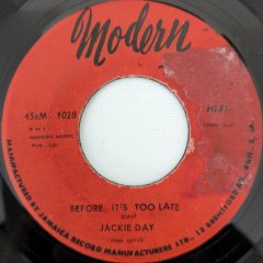
Platters 81 Posted August 15, 2012 Posted August 15, 2012 E. Rodney Jones R&B Time Am I correct in thinking the BLACK lettering is first issue on Tuff and then re-issued with BROWN lettering for the logo ? I have the black lettering and have always believed the above to be true????? i had both at one time (then i sold the black one (i was going thru my "beige" period at the time) then i was told the brown was a boot ...why i believed this i dont know as it was a common 45...my theory is that the brown was first because for the second run they ran out of brown ink and had to use the plentiful black
Sebastian Posted August 15, 2012 Posted August 15, 2012 (edited) my theory is that the brown was first because for the second run they ran out of brown ink and had to use the plentiful black I don't know which came first, but neither the black print or brown print are bootlegs. As far as I know, the Bobby Copney 45 was the first release on TUFF which utilised the plain yellow/orange label. Previous releases from TUFF 402-413 had been on a multicoloured label with black print. I've only seen Bobby Copney with brown print on the label, so perhaps the following three 45s were also first released with brown print, but I don't know. Does Bobby Copney exist with black print? There seems to have been some confusion as whether to use brown or black print on the new plain yellow/orange label design and at least three of the releases exist with both brown and black print. Perhaps those three that exists with both black & brown print indeed were pressed slightly later due to demand, but have in mind that TUFF 419-421 exclusively seems to exist with black print (please, correct me if I'm wrong), and then 422 is again available with both black and brown print on the revived design that was earlier used for TUFF 369-401. So the time-span in which this all can have happened is limited. I've seen the following releases with: MULTICOLOURED LABEL WITH BLACK PRINT Tuff 413 - Landy McNeil - Hang Your Soul On Me / Show Me - 1965 YELLOW LABEL WITH BROWN PRINT Tuff 414 - Bobby Copney - Love Au-Go-Go / Ain't No Good - 1965 YELLOW LABEL WITH BROWN or BLACK PRINT Tuff 415 - Bobby Treetop -So Sweet, So Satisfying / Valentine - 1965 Tuff 417 - Bobby Treetop - Wait Till I Get To Know Ya / Valentine - 1965 Tuff 418 - E. Rodney Jones - R & B Time (Part 1) / R & B Time (Part 2) - 1965 WHITE PROMO ONLY (DOES AN ISSUE EXIST?) Tuff 416 - Ronnie Savoy - Pitfall / On The Spanish Side - 1965 YELLOW LABEL WITH BLACK PRINT Tuff 419 - Little Joe Roman -When You're Lonesome (Come On Home) / We Got A Love - ? Tuff 420 - Vicki Anderson - I Can't Stop Loving You / I Got A Good Man (And I Know It) - 1967 Tuff 421 - E. Rodney Jones - Peace Of Mind / Do The Thang - ? REVIVED "ROUND LOGO" LABEL WITH BROWN or BLACK PRINT Tuff 422 - Mickey & Larry & The Exciters - My One Chance To Make It / Reaper Of Rain - ? Edited August 15, 2012 by Sebastian
Guest Posted August 15, 2012 Posted August 15, 2012 Is it really upsetting that someone didn't know the answer to what text color was first? I don't know. There has been some very informative posts in this thread, along with a lot of interesting assumptions; much like the assumption that I found it 'upsetting' that the question wasn't answered 'Surprised' that it wasn't mentioned before my post as there seemed to be questions over re-issues and 'to meet UK demand' - and as I said, some very informative and interesting posts. .... so yes, surprised would be more apt I think to find that it wasn't mentioned before and that the question went unanswered; especially it light of the in-depth facts & guesswork, one would have thought the subject of the differing Logos would have had a mention Anyway, enough of the petty assumptions and back to the thread..... My copy I went on Mr Manship's site and this is what he has to say: "a timeless Northern Soul classic - first press with TUFF logo and lettering in black. Seldom seen for sale." p.s. I was also surprised at the price tag on there
Guest Posted August 15, 2012 Posted August 15, 2012 this guy is advertising the BROWN logo as a '1970's repress' https://www.ebay.com/itm/ws/eBayISAPI.dll?ViewItem&item=290670786006&item=290670786006&lgeo=1&vectorid=229466#ht_865wt_1163 I personally have no idea but would be interested if anyone did know the facts behind the logo colours
Guest john s Posted August 15, 2012 Posted August 15, 2012 this guy is advertising the BROWN logo as a '1970's repress' https://www.ebay.com/...6#ht_865wt_1163 I personally have no idea but would be interested if anyone did know the facts behind the logo colours So's this bloke but at 4 times the price! https://www.ebay.co.uk/itm/E-RODNEY-JONES-R-B-TIME-PART-1-c-w-PART-2-TIMELESS-CLASSIC-LISTEN-/290701101492?pt=UK_Records&hash=item43af22c9b4#ht_576wt_1063
Guest Posted August 15, 2012 Posted August 15, 2012 So's this bloke but at 4 times the price! https://www.ebay.co.u...4#ht_576wt_1063 but lets be fair...he is cheap on his postage
boba Posted August 15, 2012 Posted August 15, 2012 There has been some very informative posts in this thread, along with a lot of interesting assumptions; much like the assumption that I found it 'upsetting' that the question wasn't answered I apologize for misreading the motivation of and emotion in your followup post asking why nobody had responded to your previous post.
Garethx Posted August 15, 2012 Posted August 15, 2012 Those two brown logo copies are indeed represses. The best way to tell without seeing the deadwax info is the weight of the type used on the credits. Both the ebay copies have the title / artist info in a light weight font. The originals (both with black and brown logos) have the title and artist in much heavier weight of type. I'm calling these later copies 're-presses' but they might well be bootlegs for the UK scene. I don't know, but it's worth bearing in mind that Spector still to this day retains a presence in the music business with a relaunched or continuing Tuff: https://www.tuffrecords.com/
KevH Posted August 15, 2012 Posted August 15, 2012 (edited) There are Treetop's in the US,mainly in the Dakota and Oregon states.Could be of American Indian origin,but why use that name,unless there's a family connection.? There's also one Robert Copney who lived in NY '1945 - 2005. Edited August 15, 2012 by KevH
Sebastian Posted August 15, 2012 Posted August 15, 2012 Those two brown logo copies are indeed represses. The best way to tell without seeing the deadwax info is the weight of the type used on the credits. Both the ebay copies have the title / artist info in a light weight font. The originals (both with black and brown logos) have the title and artist in much heavier weight of type. Excatly. ORIGINAL: RE-PRESS
Garethx Posted August 15, 2012 Posted August 15, 2012 The typefaces used for the credits on the original copies are Tempo Bold Condensed and Tempo Black. Basically a version of Futura designed specifically for the Ludlow typesetting system. The repress/bootleg more than likely uses a conventional version of Futura.
Guest Posted August 15, 2012 Posted August 15, 2012 (edited) I apologize for misreading the motivation of and emotion in your followup post asking why nobody had responded to your previous post. with the depth this topic went into I thought the previous post would have been of some interest..... I thought it to be relevant to the discussion .... but obviously not Edited August 15, 2012 by mikecook


Recommended Posts
Get involved with Soul Source
Add your comments now
Join Soul Source
A free & easy soul music affair!
Join Soul Source now!Log in to Soul Source
Jump right back in!
Log in now!