Just want to verify this is a reissue, I think it is but if you look in JM's price guide the label layout is the same as the original one pictured in there and different to the reissue.
JM has one for sale on his site described as 2nd issue turqouise with blue font (styrene)

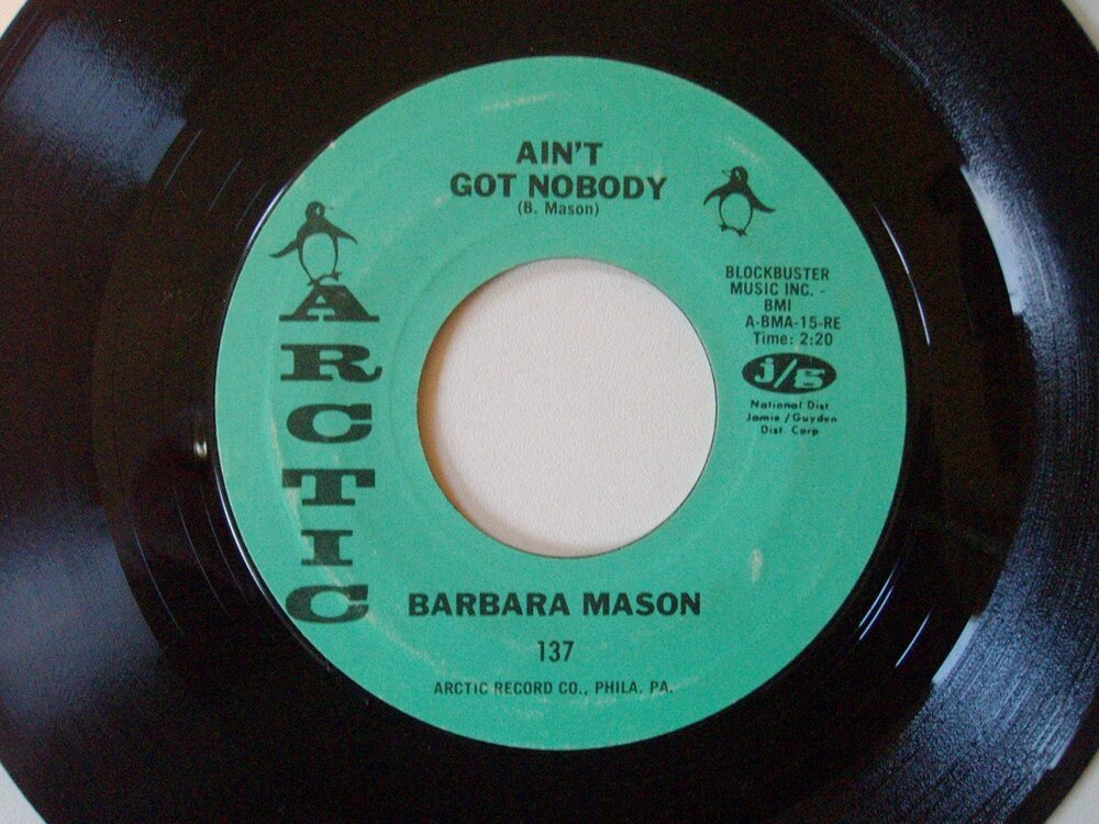


Just want to verify this is a reissue, I think it is but if you look in JM's price guide the label layout is the same as the original one pictured in there and different to the reissue.
JM has one for sale on his site described as 2nd issue turqouise with blue font (styrene)
Mine is turqouise with black font and is styrene.
Any help would be appreciated:thumbsup: