45cellar Posted December 5, 2009 Posted December 5, 2009 (edited) I am always Intrigued by the different Label Variations. The thing that stands out with many Titles, is just that, the Title. One Line, Two Lines, Sometimes Three etc & Different Size Font for the same Release. Considering the Quality Control aspect, did the Label Owners care beyond their Individual Logo. Just wondering if this is a Regional Thing,Printers allowed to do whatever they wished beyond the Logo.Differences Of Time Regarding Press. Picked this one purely as an example of many, Just happened to be a Brunswick Label. Here's a DEMO for this release, Is this a clue as to first off the press with above Stock Copies, or Just a coincidence. Edited December 5, 2009 by 45cellar
45cellar Posted December 5, 2009 Author Posted December 5, 2009 (edited) Here are three others. I know that different Pressing Plants are Involved here, Incuding different time of Issue. The thing that stands out Beyond that are the Title's and Artist Credits. Sometimes an attempt made on one line, even by reducing the font size, & then split the other over a couple of lines. I'm guessing that the printer had complete control here, without any Quality Control regarding the credit layout from the Label Owner, once the Logo had been established & Label Blanks produced. Edited December 6, 2009 by 45cellar
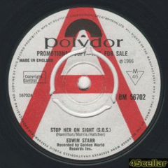
45cellar Posted December 5, 2009 Author Posted December 5, 2009 Another Example Regarding the Title. Same Layout as the DEMO below. And a WEST COAST Monarch Delta # 69164
Harry Crosby Posted December 5, 2009 Posted December 5, 2009 Morning roger, intresting stuff, will be watching for the outcome with intrest-HARRY
45cellar Posted December 5, 2009 Author Posted December 5, 2009 (edited) Morning roger, intresting stuff, will be watching for the outcome with intrest-HARRY Morning Harry, It is something that I have noticed over the years, Major Labels Too. Almost an "Oh, That'll Do" attitude, Regarding the Label Credits. Edited December 5, 2009 by 45cellar
Sean Hampsey Posted December 5, 2009 Posted December 5, 2009 I think your assessment is spot on Roger. The Blank label is the only fixed aspect. Title, Artist and other credits were largely open to interpretation. Just so long as the correct information is displayed, the 'label owner' would leave the rest to the Printer / Compositer. I used to work for a Printer many years ago - long before Apple Macs took over. Typesetting was an art in itself - and nobody would ever second guess a typesetter as to how the type would or should appear. The rate at which releases were coming off the press would mean that they simply wouldn't have the time to get into the minutiae of 'one line or two' especially as there's no particular 'right or wrong'. It would be just about getting the job done! Always makes me smile when I observe how much importance the Soul 45 collector puts on such matters. I just think, they've obviously never worked in a busy printers! Sean
45cellar Posted December 5, 2009 Author Posted December 5, 2009 (edited) Many Thanks Sean for confirming my thoughts on this subject, and for giving a first hand Insight into the day to day life in a Printing Environment. The printer is often overlooked, yet an plays such an Important part in the collecting of the Various Labels. To my ears, the music from the 60's is second to none, but to me the Label owners obviously trying for Hit records at the time appear to have taken their eye off the ball regarding the Impact with certain titles Via the printers.. Where would you split the title, "HOW SWEET IT IS TO BE LOVED BY YOU" In my opinion, certainly not like this. Same goes for "THE SOUL BROTHERS" Credit. Edited December 5, 2009 by 45cellar
Soulsider Posted December 6, 2009 Posted December 6, 2009 Well if you are really looking for an answer Roger - I always thought How Sweet It Is should be How Sweet It Is (To Be Loved By You). Two lines with the bracketed words on the second line. Mick
45cellar Posted December 6, 2009 Author Posted December 6, 2009 (edited) Well if you are really looking for an answer Roger - I always thought How Sweet It Is should be How Sweet It Is (To Be Loved By You). Two lines with the bracketed words on the second line. Mick Hi Mick Exactly, How Sweet It Is (To Be Loved By You), brackets or not, the Label I mention reads like How Sweet It Is To (Be Loved By You) Edited December 6, 2009 by 45cellar
Guest Brett F Posted December 21, 2009 Posted December 21, 2009 (edited) Brilliant topic, and one thats always interested me, good to hear Sean's view, knowing he worked at a printers, the thing that really gets me with the the differing label variations is that some are obviously rarer than others.i don't mean different spelt titles just the differing label design, logo and text layouts.........For instance which of the Barbara Mason 's are harder than the other, same as the Jackie Wilson shown above, i have both and of course i have many records where i have noticed these differences etc when looking for vinyl. Brett by the way i've thought for a long time there should be a sub section, purely for people to post up label scans. i think it would be interesting for vinyl anoraks and the mentally institutionalized.............. Edited December 21, 2009 by Brett F
45cellar Posted December 21, 2009 Author Posted December 21, 2009 (edited) Brilliant topic, and one thats always interested me, good to hear Sean's view, knowing he worked at a printers, the thing that really gets me with the the differing label variations is that some are obviously rarer than others.i don't mean different spelt titles just the differing label design, logo and text layouts.........For instance which of the Barbara Mason 's are harder than the other, same as the Jackie Wilson shown above, i have both and of course i have many records where i have noticed these differences etc when looking for vinyl. Brett by the way i've thought for a long time there should be a sub section, purely for people to post up label scans. i think it would be interesting for vinyl anoraks and the mentally institutionalized.............. Thanks Brett Definiteley Interesting to see record scans, We tried at Hitsville to cover a few of the Labels >>> LINK <<< Here's a Rare Brunswick Stock Copy, Yet I have seen at least 3 Different Label Variations. Three pictured below. Makes you wonder why it's so bloomin' hard to find. Once a record was recorded, it astounded me that certain aspects were left almost to chance, sometimes with with spelling mistakes or totally random split of credits over more than one line. A similar thread has been started, but regarding the "" and the lack of company advertising on such. Apart from MOTOWN related labels, a lot of the DETROIT Stuff came in just a plain White or brown Sleeve. Missed oppourtunity or what. Edited December 21, 2009 by 45cellar
Harry Crosby Posted December 21, 2009 Posted December 21, 2009 Great thread, ive allways wondered if any labels wich changed format ie RCA/MGM etc at certain dates, if there were any on the change over point that mistakedly were pressed on the previous format, lots of rumours at one time of things like judy freeman on black rca stock, as we now know these were just rumours, but certainly a great talking point at the time. As roger has said a lot of the labels were just put together with no thought of mistakes etc so i suppose it could have happened. would be nice eh
45cellar Posted December 21, 2009 Author Posted December 21, 2009 (edited) Great thread, ive allways wondered if any labels wich changed format ie RCA/MGM etc at certain dates, if there were any on the change over point that mistakedly were pressed on the previous format, lots of rumours at one time of things like judy freeman on black rca stock, as we now know these were just rumours, but certainly a great talking point at the time. As roger has said a lot of the labels were just put together with no thought of mistakes etc so i suppose it could have happened. would be nice eh Hi Harry Here's one from earlier this year. The Chalfontes - He Loves Me - Black Label. (I've used the Confessin' Side For Comparison To The One from ebay). Edited December 21, 2009 by 45cellar
45cellar Posted December 21, 2009 Author Posted December 21, 2009 Here's an oddity that I managed to win on ebay this year, Possibly a test run at the printers when Logo Changed from one Design to another.
Harry Crosby Posted December 21, 2009 Posted December 21, 2009 Hi Harry Here's one from earlier this year. The Chalfontes - He Loves Me - Black Label. (I've used the Confessin' Side For Comparison To The One from ebay). Wow great stuff roger
45cellar Posted December 21, 2009 Author Posted December 21, 2009 (edited) Wow great stuff roger I tried my best to win it, but got outbid at the Last Minute Certainly never seen one before, Just goes to show though, who knows what may be out there. Hopefully, the M-G-M or RCA Variations, that you mention Harry. Edited December 21, 2009 by 45cellar
Harry Crosby Posted December 22, 2009 Posted December 22, 2009 I tried my best to win it, but got outbid at the Last Minute Certainly never seen one before, Just goes to show though, who knows what may be out there. Hopefully, the M-G-M or RCA Variations, that you mention Harry. Ive never seen that variation before roger, don`t know wether ive asked this before, but whats the story behind the yellow RCA demo`s ie BEVERLEY ANN, DON RAY, PEGGY MARCH. Were they from a different plant or something?-HARRY
45cellar Posted December 22, 2009 Author Posted December 22, 2009 (edited) Ive never seen that variation before roger, don`t know wether ive asked this before, but whats the story behind the yellow RCA demo`s ie BEVERLEY ANN, DON RAY, PEGGY MARCH. Were they from a different plant or something?-HARRY I have two of those listed, I will try to find something out. I also have a Red DEMO, have seen a White DEMO of The Metros. Edited December 22, 2009 by 45cellar
Pete S Posted December 22, 2009 Posted December 22, 2009 Ive never seen that variation before roger, don`t know wether ive asked this before, but whats the story behind the yellow RCA demo`s ie BEVERLEY ANN, DON RAY, PEGGY MARCH. Were they from a different plant or something?-HARRY No, simply in 1968 they phased out the white demos and replaced them with yellow and they stayed like that through the 70's and 80's.
Harry Crosby Posted December 22, 2009 Posted December 22, 2009 No, simply in 1968 they phased out the white demos and replaced them with yellow and they stayed like that through the 70's and 80's. Thanks pete,
De-to Posted December 22, 2009 Posted December 22, 2009 just found this on e-bay usa motown from the phillipines,
45cellar Posted December 22, 2009 Author Posted December 22, 2009 (edited) just found this on e-bay usa motown from the phillipines, Motown certainly travelled the globe, Notice that they use the U.S.A. MOTOWN Logo. Not sure how many countries did, Holland springs to mind & possibly Brazil. Normally Tamla_Motown. PopSike.com Edited December 22, 2009 by 45cellar
Guest Dave Turner Posted December 22, 2009 Posted December 22, 2009 Japanese collector's page dealing with Goldwax label variations ---- https://tinyurl.com/yzloago
45cellar Posted December 22, 2009 Author Posted December 22, 2009 Japanese collector's page dealing with Goldwax label variations ---- https://tinyurl.com/yzloago There's two or three, I haven't seen before on there, Many Thanks for the LINK Dave.
45cellar Posted December 22, 2009 Author Posted December 22, 2009 not seen this before with solid centre, Me neither, that center reminds me of a Diamond label I have of "Chubby Checker" I think the Diamond label is Hong Kong.
Guest Dave Turner Posted December 22, 2009 Posted December 22, 2009 There's two or three, I haven't seen before on there, Many Thanks for the LINK Dave. Roger, the English is a little pigeon due to being translated but one can get the essential gist. I have often wondered with various labels when (ie what label number) the label design was changed on 1st issues. It is a minefield when reissues, pressing plants etc etc come into the equation. Having recently got back into collecting vinyl ( what a mug ) I naturally require first issues, for instance a 1965 release being a 1965 record and not a 1967 reissue. Dakar for example, at what number did it change from this to this?
45cellar Posted December 22, 2009 Author Posted December 22, 2009 Roger, the English is a little pigeon due to being translated but one can get the essential gist. I have often wondered with various labels when (ie what label number) the label design was changed on 1st issues. It is a minefield when reissues, pressing plants etc etc come into the equation. Having recently got back into collecting vinyl ( what a mug ) I naturally require first issues, for instance a 1965 release being a 1965 record and not a 1967 reissue. Dakar for example, at what number did it change from this to this? I'm not sure when Dakar Label changed Design Dave, I will try to find out.
Guest Dave Turner Posted December 22, 2009 Posted December 22, 2009 I'm not sure when Dakar Label changed Design Dave, I will try to find out. Roger, don't go to any great length as it was just an example and one of many. We probably all have a favourite design for any particular label but with my collecting head on I want the first issue and not what looks nicest. With Goldwax I prefer the plain yellow with the disc as the "O" (as the Wee Willie Walker on the site) but if the original issue was one of the other designs then that's the one I would prefer to have in my box. It would be a monumental work but its a shame there isn't a defintive book on the subject. C'mon Roger get typing and scanning as I think you're the guy to write it
45cellar Posted December 22, 2009 Author Posted December 22, 2009 I'm not sure when Dakar Label changed Design Dave, I will try to find out. Here's a couple of Motown DEMO's, Different pressing plants, Beyond The MOTOWN Logo, the credits are a completely different layout.
45cellar Posted December 22, 2009 Author Posted December 22, 2009 Roger, don't go to any great length as it was just an example and one of many. We probably all have a favourite design for any particular label but with my collecting head on I want the first issue and not what looks nicest. With Goldwax I prefer the plain yellow with the disc as the "O" (as the Wee Willie Walker on the site) but if the original issue was one of the other designs then that's the one I would prefer to have in my box. It would be a monumental work but its a shame there isn't a defintive book on the subject. C'mon Roger get typing and scanning as I think you're the guy to write it Definitely a Monumental Task Dave, trouble is that there's so much Information lost through the years. If time were available, a Book would be brilliant as a reference, hopefully able to scratch the surface on this forum. It took years at Hitsville to try to find a scan of every DEMO & Stock Copy for Ric-Tic. We're almost there barring a couple that may never turn up. i.e. LITTLE ANN Ric-Tic RT-142 DEMO Anyone Seen a copy.
45cellar Posted December 22, 2009 Author Posted December 22, 2009 No, simply in 1968 they phased out the white demos and replaced them with yellow and they stayed like that through the 70's and 80's. Thanks Pete. Have you seen any that were Issued on both designs during transition between the two.
John Benson Posted December 22, 2009 Posted December 22, 2009 Interesting stuff there Roger! Funnily enough only last night I was looking at three variations of a US 70's 45 that I hadn't really noticed before. It was Debbie Taylor's Arista side "Just don't pay" and they were all slightly different. layouts, two of them having a logo on the left hand side of the label, ('Touch of Gold') which isn't on mine - which is what drew me to checking out others for sale. Here's one like mine: Here's the two with the logos: Yes, it's a funny thing this collecting lark isn't it!
45cellar Posted December 23, 2009 Author Posted December 23, 2009 (edited) Interesting stuff there Roger! Funnily enough only last night I was looking at three variations of a US 70's 45 that I hadn't really noticed before. It was Debbie Taylor's Arista side "Just don't pay" and they were all slightly different. layouts, two of them having a logo on the left hand side of the label, ('Touch of Gold') which isn't on mine - which is what drew me to checking out others for sale. Here's one like mine: Here's the two with the logos: Yes, it's a funny thing this collecting lark isn't it! Certainly is John. Over the years before the Internet, different Variations were noticed. However, now we have the chance to compare stuff at the press of a button, many more things are now showing up. Many Thanks for the Debbie Taylor Scans, Just shows that almost every Label continued through the 60's & 70's without too much thought toward the Credits, as long as they're somewhere on the label. Different Font, Size, BOLD, CAPS, emphasis changing from one print run to another. All it would appear controlled by the Printer, without question from Label Owner. Even the Motown Empire where I had always thought that EVERY aspect was under close Quality Control Have Various degrees of attention to Detail where the Label Credits were concerned. Edited December 23, 2009 by 45cellar
Guest Posted December 24, 2009 Posted December 24, 2009 I have two of those listed, I will try to find something out. I also have a Red DEMO, have seen a White DEMO of The Metros. i've got a white demo of metros sweetest one - will try and get scan up soon
45cellar Posted December 24, 2009 Author Posted December 24, 2009 i've got a white demo of metros sweetest one - will try and get scan up soon Many Thanks, I'm not sure when the Red DEMO Was pressed, It has "SWEETEST ONE" both sides. The White one definitely Initial Release.
Guest Posted December 24, 2009 Posted December 24, 2009 Many Thanks, I'm not sure when the Red DEMO Was pressed, It has "SWEETEST ONE" both sides. The White one definitely Initial Release. white demo has 'Time Changes Things' on other side (I personally prefer TCT to 'sweetest one')
purist Posted December 24, 2009 Posted December 24, 2009 RCA red labels, not saying they were exclusively pressed there, but every red demo I've had has come from Canada-mind I've only had about four. Having said that Canada has some great looking label variations, which often get confused with the USA issues (The Canadian black Decca is one of my fave looking labels, simple classic kind of matt looking, also like the Mercury two colour issue label, so much nicer than the plain red of the USA issue) btw Does anybody else think the printers were given the order over the phone, hence the basic details being right, but the layout altering? My guess is the companys priority was to get the single pressed as quickly as possible, especially the top up orders, so it was probably all rush & hurry. I tend to assume the non standard looking label variations were from these later 'post release date' orders, but there's a story behind the bootleggers who operated in that era. There was a big net chat about this subject years back, was it on the old soul talk list?
45cellar Posted December 24, 2009 Author Posted December 24, 2009 (edited) RCA red labels, not saying they were exclusively pressed there, but every red demo I've had has come from Canada-mind I've only had about four. Having said that Canada has some great looking label variations, which often get confused with the USA issues (The Canadian black Decca is one of my fave looking labels, simple classic kind of matt looking, also like the Mercury two colour issue label, so much nicer than the plain red of the USA issue) btw Does anybody else think the printers were given the order over the phone, hence the basic details being right, but the layout altering? My guess is the companys priority was to get the single pressed as quickly as possible, especially the top up orders, so it was probably all rush & hurry. I tend to assume the non standard looking label variations were from these later 'post release date' orders, but there's a story behind the bootleggers who operated in that era. There was a big net chat about this subject years back, was it on the old soul talk list? Interesting regards Red Label DEMO Possibly being Canadian as I have been steadily collecting Canadian Labels from time to time. I have seen the DECCA Label that you mention, yet to own one though. Also notice that the Canadian Back Beat is Black similar to the Decca. I think that you may be right about the Telephone Orders, It would explain some of the Spelling Mistakes etc, also these well known titles to us now, were new & therefore not so well known so mistakes were Inevitable I suppose. I would love to see some of the DEFINITE Bootlegs of the period, so much has been left to pure speculation as we approach 2010. They could be easily be responsible for some of the Variations, that we now, 40 to 50 years later consider pressing plant differences. Edited December 24, 2009 by 45cellar
soulAdequateNP Posted December 26, 2009 Posted December 26, 2009 Here's a couple of Motown DEMO's, Different pressing plants, Beyond The MOTOWN Logo, the credits are a completely different layout. And here's another variant of this one - I imagine there were quite a lot of US demos sent out of major hits like this one, and thereby a good few variations. By the way, does anyone here know the story behind the red vinyl Motown demos of which there seem to have been quite a few?
45cellar Posted December 26, 2009 Author Posted December 26, 2009 (edited) And here's another variant of this one - I imagine there were quite a lot of US demos sent out of major hits like this one, and thereby a good few variations. By the way, does anyone here know the story behind the red vinyl Motown demos of which there seem to have been quite a few? Thanks for the Red Vinyl DEMO Scan for Motown M-1126 I'm not sure which came out first, Just another promotional gimmick I'm guessing, However there are still differences with some of the tracks. Wasn't "Stoned Love" Only Available as a 45 on Red Vinyl & Yesteryear using the Long Intro. Here's a Normal DEMO with both A & B & Double A Side Red Vinyl. The Label Credits are Almost Identical for the A Sides Except the Matrix Info On Label, Just Below The Jobete-BMI Edited December 26, 2009 by 45cellar
Guest Posted December 28, 2009 Posted December 28, 2009 i've got a white demo of metros sweetest one - will try and get scan up soon here's another label difference regarding colour. The demo's i've seen of this are white, can anyone give any info on the yellow?
De-to Posted December 28, 2009 Posted December 28, 2009 ive never seen a yellow demo of cp before as you say only white demos,!!!
45cellar Posted December 28, 2009 Author Posted December 28, 2009 (edited) here's another label difference regarding colour. The demo's i've seen of this are white, can anyone give any info on the yellow? Not sure, I'll try to find something out. Here's the White one for comparison. Many Thanks for Posting The Metros Scans. PopSike.com Edited December 28, 2009 by 45cellar
Guest Posted December 28, 2009 Posted December 28, 2009 Not sure, I'll try to find something out. Here's the White one for comparison. Many Thanks for Posting The Metros Scans. PopSike.com many thanks - any info would be greatfuly recieved
Sebastian Posted December 28, 2009 Posted December 28, 2009 Dakar for example, at what number did it change from this to this? Dakar went through three numbering systems and all had different label layouts. The first series (in 1968-ish) DAKAR 1449 - DAKAR 1452 had a plain black/silver layout: The second series looked similar, but was coloured. It was acrive from 1968-1971 and went from DAKAR 600 - DAKAR 626: The third series was completely different. It was active from 1972-1977 and went from DAKAR 4501 - DAKAR 4569:
45cellar Posted December 28, 2009 Author Posted December 28, 2009 Dakar went through three numbering systems and all had different label layouts. The first series (in 1968-ish) DAKAR 1449 - DAKAR 1452 had a plain black/silver layout: The second series looked similar, but was coloured. It was acrive from 1968-1971 and went from DAKAR 600 - DAKAR 626: The third series was completely different. It was active from 1972-1977 and went from DAKAR 4501 - DAKAR 4569: Many Thanks Sebastian I don't have that many on the DAKAR Label to compare.


Recommended Posts
Get involved with Soul Source
Add your comments now
Join Soul Source
A free & easy soul music affair!
Join Soul Source now!Log in to Soul Source
Jump right back in!
Log in now!